ADVERTISEMENT
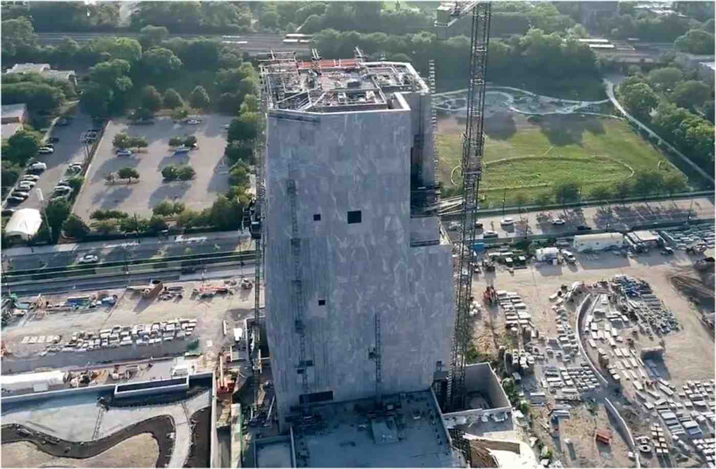
The building is meant to symbolize four hands coming together in unity. If you don’t see that when you look at it, don’t worry; no one else does either. The exterior features words from one of Obama’s speeches, but they’re displayed so poorly that it’s difficult to read them, which reflects poorly on Obama himself.
It was designed for Obama by Billie Tsien and Tod Williams, who recently revealed the design “very much a product of his vision as well as ours” after the former president repeatedly pressed them to make the design as “bold” as possible.
Williams said, “He drew on one of my drawings, made a strong mark, which indicated that he didn’t think I was being bold enough.” [….]
But as hideous as the building itself is, some of the merch they’re going to hawk to the public is even goofier:
It comes in mens and womens and lets your friends know you’re happy to express your views and don’t care what anyone thinks! Cheers!
“The pin represents the intersection of bold design and global leadership,” the website reads, noting the proceeds go to the Obama Foundation “to inspire, empower and connect people to change their world.”
Many weren’t impressed with the pricey pins — with some comparing them to chewing gum, pregnancy tests and blobs of toothpaste.
“How is that even uglier than the actual building?” said another.
Obama’s Center has become a symbol of failure. It has taken over ten years to develop, faced local protests, and its costs have soared from the original estimate of $500 million to $850 million. The design, often referred to as the “gray blob,” perfectly encapsulates this sense of failure.
ADVERTISEMENT